Time for a trip down memory lane! If you’re a regular visitor to the Filament Games website and/or hardcore player of our holiday games, you’re probably familiar with our beloved mascot, the Filabee. With a positive attitude, a bright color palette, and a totally on-brand flight pattern, the Filabee is very much our hero. As we all know, any good hero needs an origin story, and this blog post is in fact that origin story! We recently dug up some concept and pitch materials from the Filament Archives, and thought it would be fun to sit down with Art Manager Chenya Chang and talk about the process of creating our mascot waaaay back in 2014, which she spearheaded at the time in her previous role as an illustrator.
What was the impetus behind creating a mascot?
Chenya: Well, at the time we had been joking for years about having a company mascot. We were in the process of redesigning our website in 2014 and given that we are a playful and friendly company, we thought we would take the opportunity to develop a mascot that would embody those brand characteristics. I pitched a number of potential options – let’s start with Phil the Filament Fish.
So because we have the double swirl (fashioned after the filament of a lightbulb) as a core element in our logo, we wanted an animal and shape that could produce that swirl. As you see in the illustration, Phil’s swimming in a way that’s creating a swirling trail that closely matches our logo swirl. We were also taking motion graphics into consideration, and thinking about ways that the mascot could be animated to create the swirl in an authentic and natural way. Also, to be totally honest, I just wanted to draw some floaty fins. Anyhow. From here, we explored a broader variety of possibilities:
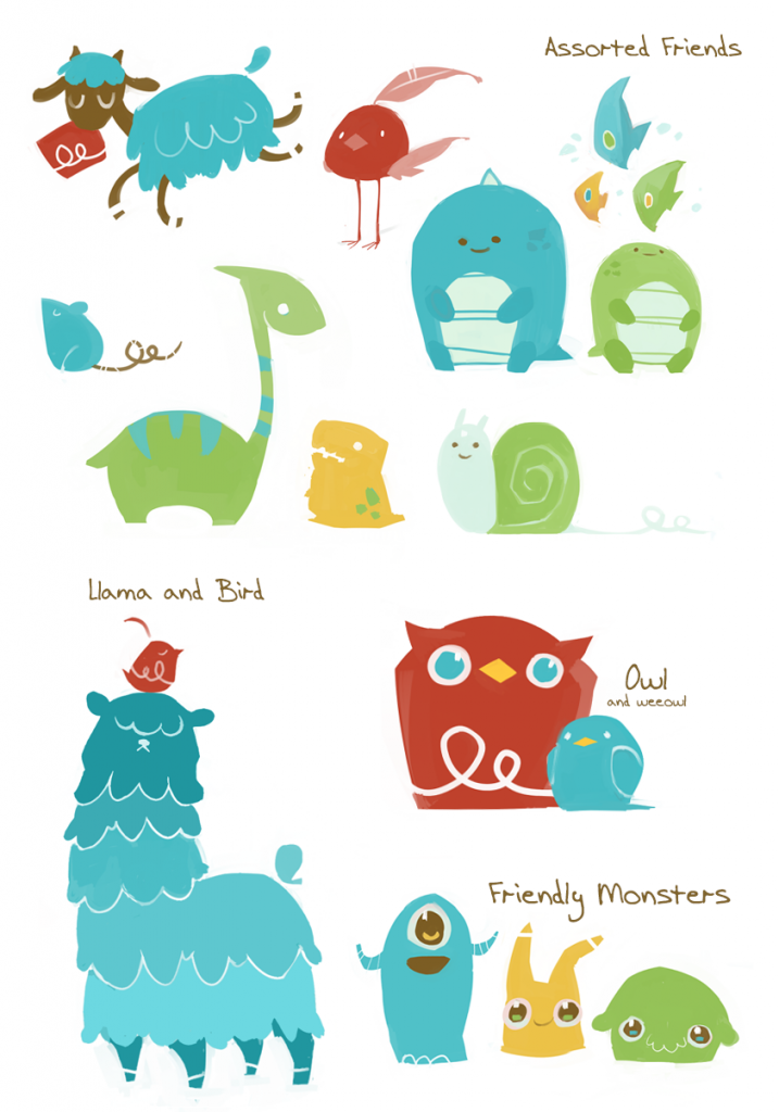
The above consortium of whimsical animals were a series of color and shape explorations. We were working with the Art Manager (Trevor Brown, at the time) to establish brand colors during the aforementioned 2014 website and materials refresh. Given a limited palette, we were investigating what kinds of personality we could imbue our mascot with, using different shapes. The bee concept emerged from that conversation, and from there we developed some more robust materials around the pitch for that mascot:

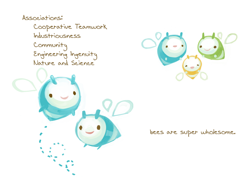
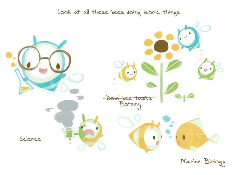
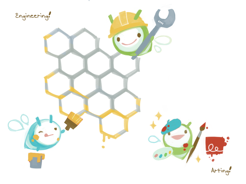
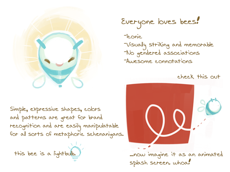
The pitch materials largely speak for themselves, but to summarize – the bee fit a lot of the brand traits we were looking to embody, it worked for making our logo swirl in an animation, and it even has a resemblance to a lightbulb, which works nicely for a company named after filaments! The only feedback we got this round was to use more traditional bee colors (i.e., black and yellow) as opposed to the primary color depictions in the above. That’s how we arrived at our present-day Filabee! Here are some current examples and applications:
Friendship!
Spooky Halloween!
Web Presence!
Swoopy Brand Logo In Action!
So there you have it – the origin story of the legendary Filabee. Hopefully this provided some insight into the creative branding and marketing process, as well as a new perspective on why we chose the noble bumblebee as our corporate mascot! Keep an eye out for Filabee on our website, and maybe even in our next holiday game. Until next time!