To celebrate the recent launch of iCivics’ newly-upgraded Immigration Nation, we sat down with Colin Skinner, Game Designer at Filament Games and lead designer on the project, for a behind-the-screens look at the process of remaking one of iCivics’ most celebrated games. Check out the full interview below!
Tell us a little about yourself and your role as Game Designer on Immigration Nation?
I joined Filament in March of this year, and Immigration Nation was the first project I worked on. I actually joined the team halfway through the design phase, inheriting the project from another designer. By that point, the basic concept for the game was pretty much fully conceived. But the game designer’s job isn’t done until the game ships! There was still plenty for me to do throughout the remainder of the project: refine the mechanics, work with the UX designer on wireframes, design the levels and scoring system. Most importantly, the designer is there to help solve all the little design problems that we knew would crop up along the way, even if we didn’t yet know what those problems would be.
Give us a brief overview of the history of iCivics’ Immigration Nation…
Immigration Nation is an educational game about all the ways that people can become citizens of the United States. The original version of the game was released in 2010. It was generally well-received, with upper elementary school teachers praising its important subject matter and simple gameplay (the game skews toward a younger age range than some of iCivics’ other titles).
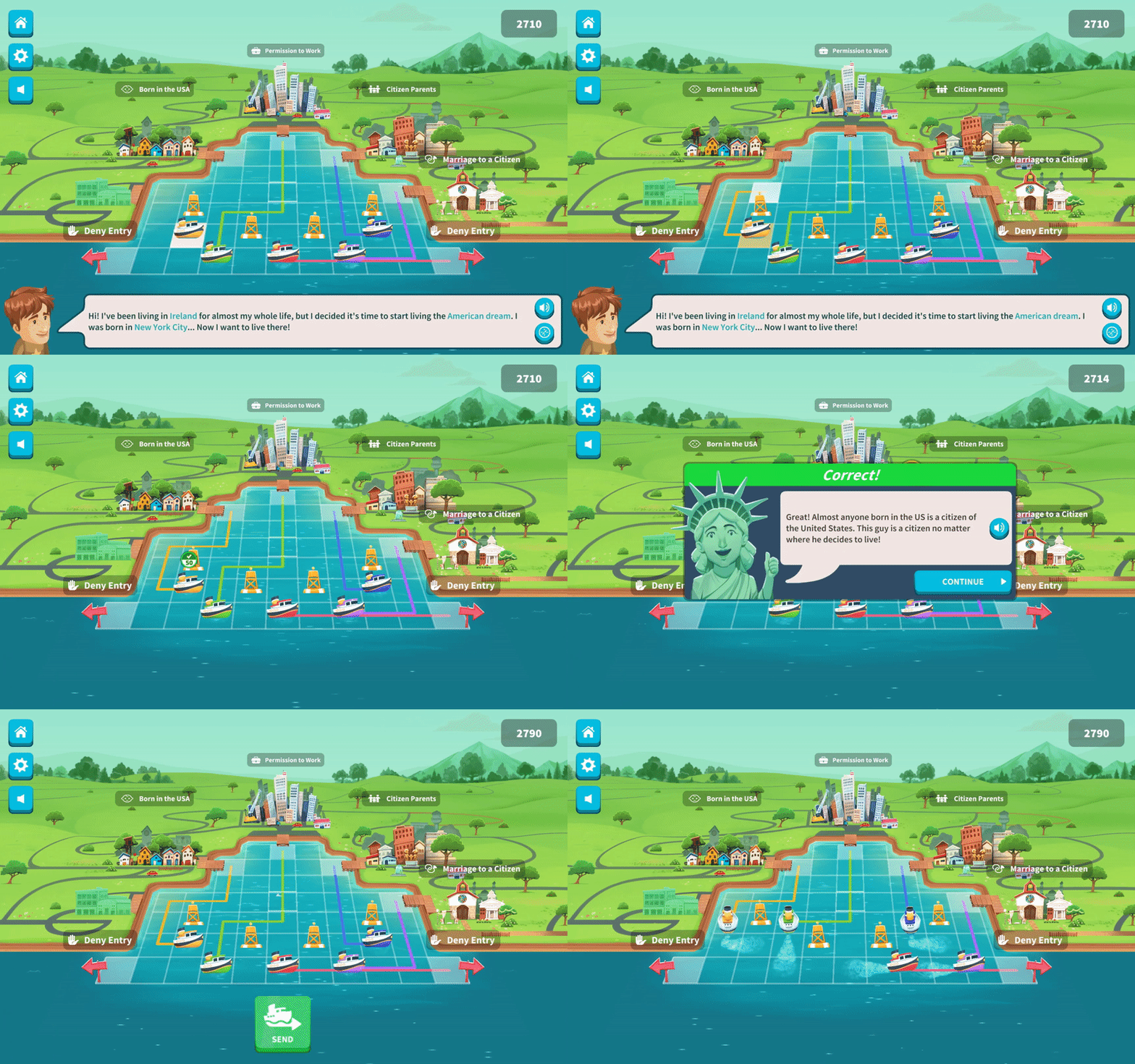
In the game, you overlook a bay with five harbors. Each harbor represents a different path to U.S. citizenship: being born here, having citizen parents, getting a job here, marrying a citizen, or being a refugee. Travelers arrive on boats, and you talk to each traveler and decide which harbor to send them to based on their situation. For example, a traveler might explain that they were born abroad when their parents (who are both citizens) were on vacation. If you correctly selected the Citizen Parents harbor, you’d see the boat travel there, get positive feedback, and earn points.


Talk about some of the biggest upgrades to this new version of Immigration Nation…
The core of the original Immigration Nation is solid. It’s an effective learning game because the main mechanic and the main learning objective are basically one in the same―players learn the different paths to citizenship as they decide where to send travelers. Thinking about how to improve the game, we wanted to introduce some fun mechanics around the periphery that would add interest and give players more of an incentive to engage with the learning content. What if, in addition to choosing each boat’s destination, the player also got to specify the paths they would take to get there?
Taking this idea and running with it, we created Puzzle mode, which you can play in the new game. You connect boats to harbors by drawing paths on a grid, and then press a button and watch the boats go. There are obstacles to avoid and things to collect, and you get bonus points for finding efficient solutions in which the boats reach their harbors quickly. To encourage experimentation, we made it easy to redo the path-drawing portion of each level so players can iterate on their paths and shoot for the maximum score.
We also added some features to help struggling readers and English language learners to more easily comprehend and succeed at the game. All the spoken text has English voiceover, and a built-in glossary lets players see the definitions of key words. We also designed a tool (the “Decision Compass”) to walk players through the thought process required to make confident decisions about where to send travelers. Finally, we added Spanish language support to all on-screen text, letting players freely switch to and from Spanish, even right in the middle of a level. This feature in particular is great for native Spanish speakers who may be tasked with learning English at the same time as other standards-based content.
What was an interesting challenge you encountered when designing the game?
One interesting challenge we encountered was how to communicate which events would affect the player’s score, and furthermore to how notify the player as those events occurred without the flurry of feedback being overwhelming. In the game, you get points when you choose the correct harbor, when you choose correctly on the first try, when a boat reaches its harbor as quickly as possible, and when you see a whale or dolphin. You also lose points anytime a boat needs to wait for another boat to pass. We needed a way to communicate all those things to the player in a way they could understand and that didn’t detract from the nice experience of watching the boats travel.
We iterated on the design of this feedback a few times. The original idea was to simply show a popup with text and a number over the boat when the event happened. But we quickly realized that the popups would appear and disappear faster than the player could read them, and also that they would obscure whatever was behind them. So we moved the popups to the side of the screen, but found that had the undesirable effect of splitting the player’s attention between the action in the center of the screen and the popups on the side.
We solved this dilemma by relocating the popups back to the boats and redesigning them to use icons and colors instead of text, which allowed us to shrink them down and make them circular, kind of like coins. We also realized that we could have the first two types of coins appear when the path was drawn, rather than when the boat reached its destination. This reduced the number of things happening at the same time and made things much less overwhelming. The final piece of the puzzle was to show all the coins the player earned on the results screen after each level, giving the player ample time to review everything that happened.
Which aspects of the game were the most exciting for the team to work on?
I think we each had different things that excited us. I got pretty excited when I first saw the UX designer Steve’s designs for the coin popups and the level results screen, because I knew it meant that my scoring system was going to work and players were going to understand it. The engineer Alex did some great work getting overlapping boat paths to play nicely with each other, and programmed some neat particle effects. I think Mei, the illustrator, was just generally enthused to see her artwork animating around the scene, as this was the first game project she’d worked on. And the producer Ethan was excited to create a helpful player support tool (what ultimately became the Decision Compass) and encouraged us to make something we could be proud of there.

Did the team manage to include any easter eggs in the final game?
Yes! That was one thing everyone got excited about. We were brainstorming what kinds of sea creatures to have come out of the water for the sightseeing bonus, and Alex jokingly suggested a kraken. The more we thought about it, the more we wanted to put a kraken in the game. Fortunately our content expert and client representative Carrie knows a good idea when she hears one and gave us the green light. So if you’re playing a level with a sightseeing bonus and you see bubbles on the surface instead of the usual whale or dolphin, you’re in for a pleasant surprise!
Was the team able to reuse any bits of the original game in the remake? Or was this new version developed from the ground up using all-new art assets and code?
Most of it was developed from the ground up, with a couple exceptions. In terms of its written content, the game received a major update in 2015 to address content sensitivity concerns, and we made some more tweaks this year and also added a few additional traveler stories. Nevertheless, some of the written content from the original game has survived and made it into the new one. You may also see some familiar faces in the traveler illustrations—those assets are shared among the recent iCivics remakes. But the rest of the art and all the code was developed specifically for this new version.
Where can folks go to learn more about the game?
iCivics’ newly-remastered Immigration Nation is free-to-play at iCivics.org, as well as being available as a free download for iPad and Android tablets. Give it a try and let us know what you think – we always love hearing feedback from students, educators, and iCivics fans alike!
Click here to launch Immigration Nation!