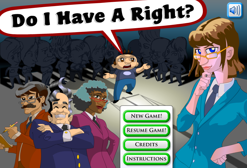
Filament Games and iCivics.org have shared a long and prosperous relationship over the years, during which they have created nineteen learning games together. These games have been played in all 50 states by students and educators alike, teaching a wide variety of civics topics from basic American rights and judicial processes to the fundamental structure of America’s government. Some players (both students and teachers) have used the visually iconic iCivics games since the very beginning when Do I Have A Right? first rolled out of our studio in 2010.
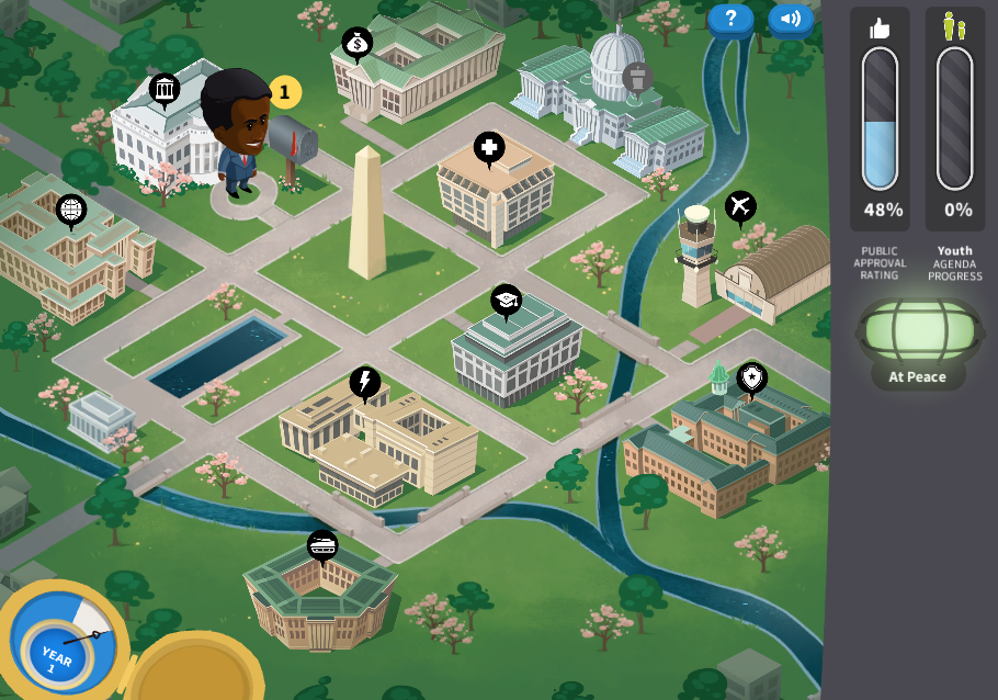
Do I Have A Right’s style of a sleek isometric field of view, along with its cast of bobble-head characters, set the stage for iCivics games to come. Since then, the majority of iCivics’ games have shared the same recognizable style, with a few outlying exceptions like Crisis of Nations and Power Play. However, an avid iCivics player may suspiciously squint at the recently-updated Executive Command map, or even the expanded cast of Win The White House 2.0 bobbles–and rightly so! 2016 marked the launch of some significant style pivots to these remade classics.
So why the facelift?
Rapidly-developing technology has digital media studios playing catchup every year, and the development of these technologies can influence artistic style shifts, in ways both obvious and subtle. Filament’s iCivics games were all originally developed in Flash, when Flash was the mainstay of small, browser-based games. As a vector program, Flash is limited in the kind of art it can produce. It’s very good at creating precise, flat assets, colored with linear or circular gradients. These nuances have been harnessed to create hard shadows with an occasional suggestion of bounced or ambient light on shiny surfaces such as characters’ hair or on satiny fabrics. Its animation features made it easier to create mobile characters than other popular 2D art programs like Photoshop.

With Flash becoming less supported as the years go by, Filament’s solution to maintain iCivics’ library of learning games is to port the existing content from Flash into Unity, which as of 2015, supports browser-based play. I use the term ‘port’ lightly here as the amount of work that goes into MacGyvering a Unity game out of a Flash original is a mere few steps removed from starting from scratch. Developers need to rebuild the game from the ground up because they’re dealing with a completely different tool. At least the very least in remaking a game, the game’s design already exists, but Unity has certain rules that Flash did not: no masking images, no blurring effects, and scaling of objects is sorely frowned upon if you want optimal performance, to list a few. On a more basic level, however, the art assets of a Unity-built remake could technically have been ‘ported’ directly to and re-animated in Unity–but breaking the hearts of our artists is not currently on our agenda.
Every year, with every new game, the studio raises its standards to enhance the overall quality of the game. Remakes should be no exception. Win The White House 2 kicked off the remakes with a strong loyalty to the original style, but with a greater level of polish. The art assets were revamped in Adobe Animate (previously Flash,) and were spruced up with a more cohesive color palette, and more consistent shading, which tightened the style overall. The user interface elements were updated as well, pivoting from the old beveled green-outlined button style to a new blue and red ‘candy’-like set with a more familiar and realistic surface and texture. These buttons are certainly more inviting to tap for tablet users!

Executive Command riffed off of the Win the White House 2 update, but made a more drastic push to gamify the world by making the map look like a playset. This game had two caveats not previously seen in Win the White House 2 in that the player avatar needed to be disproportionately large compared to the buildings on the map, and the map itself needed to be loosely based on a real-world locale. By playing on the ‘bobblehead’ aspect of the characters and bringing that same top-heavy caricaturization to the rest of the game assets, including the environment, we were able to turn the world into a plausible (digital) game board, almost akin to a toy set. Executive Command saw a second revision of the user interface assets that better matched the flatter, more cel-shaded characters that shed their Flash-quality gradients and were entirely redrawn in Photoshop.

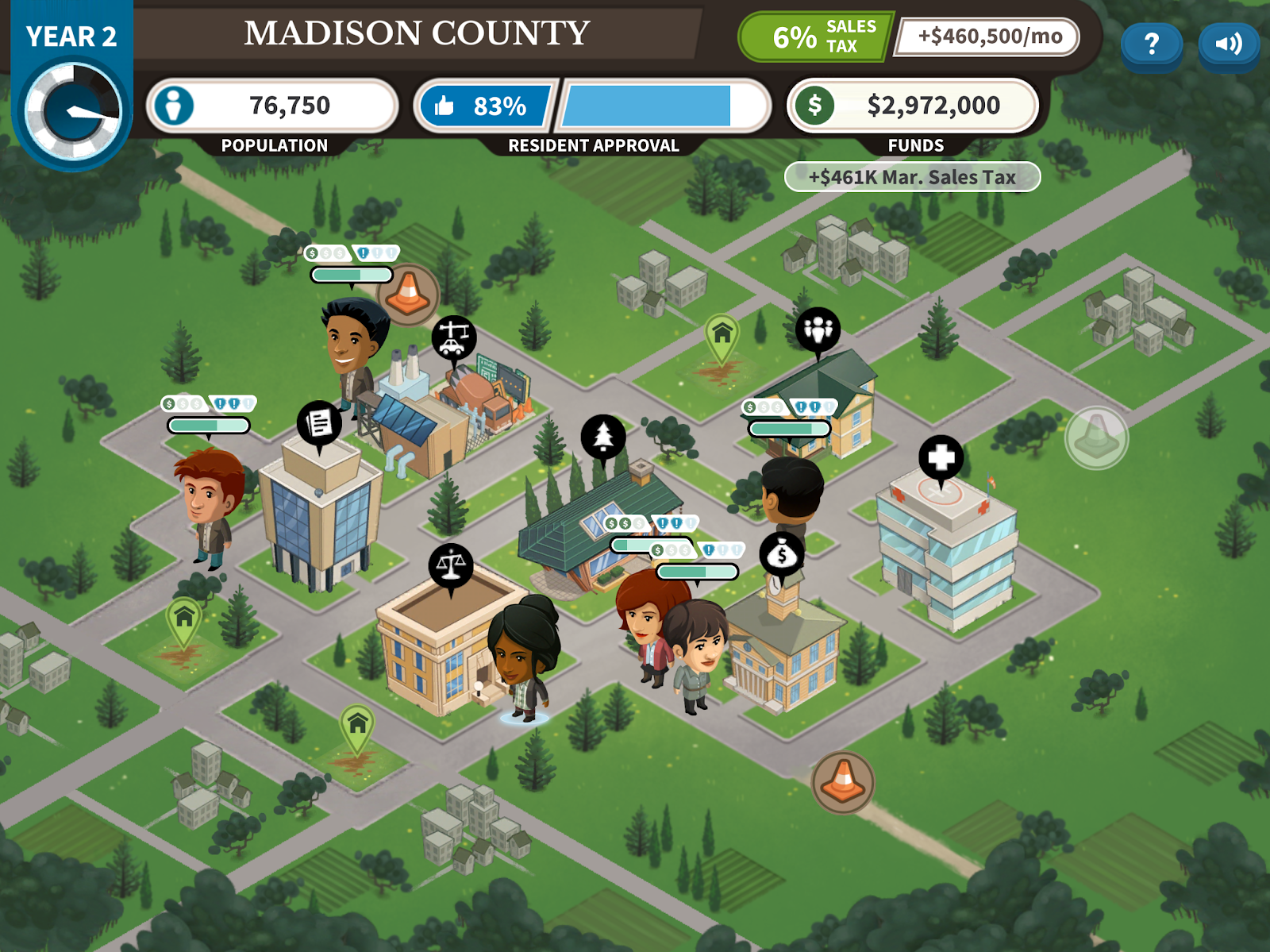
Counties Work, released today, expanded upon Executive Command’s play-space focus because it relies more heavily on the inhabitable world than did the Executive Command remake. In Counties Work, residents pop in at various points on the map’s roads that the player avatar must navigate, taking the fastest route of many possible avenues. The gameplay also requires a more responsive map that grows and shrinks with the county’s population and the player’s success. The outer reaches of the Counties Work map are more lush, populated by a wider variety of vegetation which suggests a more rural environment than Executive Command’s adapted map of the District of Columbia.
One of the team’s greatest concerns in creating such a dense map was simulating a believable sense of three-dimensional depth in a 2D space. The six county department buildings centered in the map were not interesting enough without characters being able to weave in and out between the buildings. We needed to apply a form of Z-axis (depth) sorting to have the characters able to appear behind a building for one moment, and then move in front of the same building. For the team building the game in a 3D engine, an obvious solution was reached: make the game in 3D space. The most distant objects on the map were anchored in the most distant positions in the engine world. A custom Z-axis depth sorting script was then written by one of our wizards (read: game engineers) which then allowed the characters to move forward and backward in space. All of these details serve to give the player a more immersive experience within the game as the leader of their fictional county occupied by interesting, living residents.

iCivics’ Director of Content, Carrie Ray-Hill, wanted to preserve the brand’s anchors in the game updates, namely: player customization, ease of play, and the bobble characters themselves. “iCivics games should be easy to jump into,” she said of usability; “our evolution from ‘Maddens’ (John Madden-style screen doodles to express the player’s next course of action) and click-through tutorials to helper characters and a browseable Help reference tab has made the updated games much more player-friendly.”
Of the art itself, Carrie hailed the newly updated color palettes and HUDs (Heads Up Displays–they contain vital information of the player’s current statistics in the game) as the most significant changes, adding that, “we were able to re-imagine the screen for players without pushing forth something completely unrecognizable.”
We couldn’t agree more, and we’re excited for you to try out Counties Work! But that’s not the only exciting thing about this launch date. Did you know that April is National County Government Month? This is a great chance for you to reflect on making a big impact in your local community, so be sure to go check out the newly upgraded Counties Work game!