Filament Games’ library of educational tools and learning experiences is constantly expanding. With the exception of the Filament-made iCivics line, no two games look the same. If I told you Filament only has four game artists (one of which is actually a 3D generalist), you may be so inclined as to squint dubiously. So how do we manage to pull so many different styles out of the air?
Like many artists, inspiration comes to us from other artists, from all over the world. We look at cartoons and comics, from talented tumblr niche artists to world-renowned animators. Filament’s artists are constantly exploring new styles. Every project is an opportunity to try something new! Even when we start fresh on a new project, the style is rarely nailed down right off the bat; we work with our internal team (and with the client, if applicable) to determine what style best fits the needs of the project. We have a few initial questions that that will ultimately inform stylistic decisions:
What is the target age range?
This question largely informs how simple or complex assets are, and can also inspire the color pallet.
What mood do we want the player to have during their gameplay?
If we understand how we want the player to feel, we can use details in color palette, lighting, and animation to guide the player’s experience.
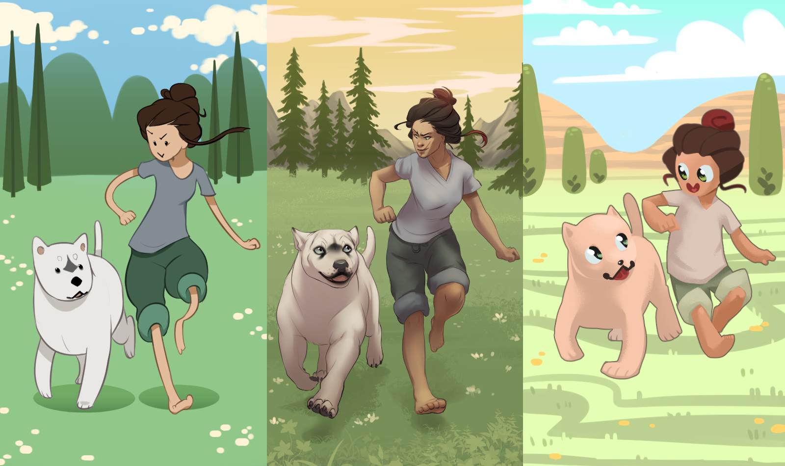
In this speed sketch, I’ve modeled three different styles, depicting two characters (one human and one animal.) The first style in the middle is my own, which I use at home on my personal projects. The second style (on the left,) is a simplified version inspired by modern day cartoons like Adventure Time and We Bear Bears. The third style (on the right,) is a youthful style that you might find in a game geared towards kindergarten-aged players.
In the final rendering, I’ve included a landscape background to match the character styles to demonstrate even how different a game’s environment might look, depending on the target age range.

The final rendering
A Note from the Composer
Our various art styles require original music that matches the aesthetic, so for our speed sketch, I thought I could demo different variations on a theme. I first jotted down three words describing each of Natasha’s pieces:
- First: Adventure/Epic/Flowing
- Second: Happy/Goofy/Silly
- Third: Playful/Young/Gamey
Each section uses the exact same chord progression and melodic line (theme), but I change the instrumentation, rhythm, and playing style to better match each piece of art.
The first section uses more traditional orchestral instruments as the style has more detail and the color palette is a bit warmer. The second section mirrors the spaghetti-like limbs and solid color aesthetic with a more bouncy, whimsical sound…I also imagined the subject skipping around saying “la-la-la-la-la”…thus…well, you’ll hear it. The third section is a bit more iconic, and uses electronic instruments that are played very sharply, reflecting the smaller proportions of the subjects and overall brightness of the color palette. The fourth section mashes all of these styles together in order to display the amazing final renders of Natasha’s art!